
Why Banner Design Is Important for Online Businesses
 June 1, 2026
 Yashwardhan Singh
 0 Comments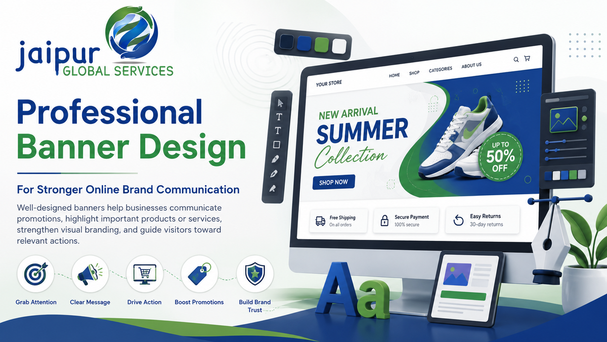
Professional Banner Design for Stronger Online Brand Communication
Well-designed banners can help businesses communicate promotions, highlight important products or services, strengthen visual branding, and guide visitors toward relevant actions.
Get Started Talk to a Design Expert
Online businesses are competing for attention across more places than ever — a website homepage, an ecommerce store, a marketplace listing, an email campaign, a social feed, a display ad, a seasonal promotion. In every one of these spaces, a banner is often the first visual thing a visitor actually sees before they read a single word of copy. Banners give businesses a fast, visual way to communicate an offer, introduce a product, announce something new, reinforce a campaign, or simply remind a visitor what the brand is about.
Effective banner design is not just about making an image look attractive. It involves visual hierarchy (what the eye notices first, second, third), branding consistency, message clarity, typography that's actually readable, imagery that supports rather than distracts from the point, sensible CTA placement, overall composition, and a genuine understanding of who's going to see it and why. This page walks through why banner design services matter, where businesses actually use banners, what separates an effective banner from a forgettable one, and what to look for if you're evaluating a provider to create them.
What Is Banner Design?
A banner, in the digital sense this article focuses on, is a visual creative used to communicate a specific message or promotion within a particular digital context — a website, an ecommerce store, an ad placement, an email, or a social post.
Common digital banner types include:
- Website banners, often the large visual at the top of a homepage or landing page
- Homepage banners, specifically designed to orient a first-time visitor
- Ecommerce banners, used for promotions, category highlights, or seasonal campaigns
- Promotional banners, built around a specific offer or discount
- Display advertising banners, used across ad networks and placements
- Social media banners, sized and designed for specific platform formats
- Marketplace banners, used within marketplace storefronts where the platform supports them
- Email banners, typically used as headers or promotional inserts within email campaigns
Banner dimensions and design requirements vary considerably by platform and placement — a website hero banner, a display ad unit, and a social media post banner all follow different sizing conventions and design constraints, which is worth keeping in mind rather than assuming one banner design works everywhere unchanged.
Why Is Banner Design Important for Online Businesses?
1. Captures attention. Visitors scan pages quickly, and a well-designed banner uses visual hierarchy — size, contrast, placement — to make sure the most important message is what actually gets noticed first, rather than getting lost among everything else on a page.
2. Communicates a message quickly. Banners are built to convey information fast — a product launch, a discount, a seasonal offer, a new service, an important announcement — without requiring a visitor to read a paragraph to understand what's being communicated.
3. Supports brand identity. Consistent use of colors, typography, imagery, and overall style across banners reinforces what a brand looks and feels like, building recognition over time rather than each promotion looking like it came from a different business.
4. Highlights important products or services. Banners give businesses a way to draw deliberate attention to specific offerings — a new arrival, a bestseller, a service worth featuring — rather than leaving visitors to find them on their own.
5. Supports user navigation. A banner can guide visitors toward a specific product category, a service page, a current offer, a landing page, or an important announcement, functioning as a visual signpost rather than just decoration.
6. Supports marketing campaigns. Banners visually reinforce a campaign's message across every channel it appears in, helping tie together an email, a website banner, and a social post into one coherent, recognizable campaign.
7. Strengthens ecommerce promotions. Seasonal sales, new product launches, and category promotions rely heavily on banners to communicate the offer clearly and prompt shoppers to explore further.
8. Creates visual consistency. Maintaining a recognizable visual style across every channel — website, store, ads, email — helps a brand feel coherent and deliberate, rather than assembled from mismatched pieces.
Where Are Banners Used by Online Businesses?
Website homepage banners. Often the first visual element a new visitor sees — the hero section — used to orient them and communicate the site's main message or current focus.
Ecommerce store banners. Used across homepages, category pages, and promotional sections to highlight offers, collections, or seasonal campaigns.
Product and category pages. Smaller, more targeted promotional creatives used to highlight relevant offers within a specific browsing context.
Display advertising. Digital banner ads placed across ad networks, following specific size and format requirements for each placement.
Social media. Promotional and branded creatives sized and designed for each platform's specific formats and conventions.
Email marketing. Header banners and promotional inserts used to reinforce a campaign's message within an email.
Marketplace stores. Where supported, storefront banners used on marketplace platforms to reinforce brand identity within that platform's specific storefront format — exact specifications vary by marketplace and are worth confirming directly with the platform rather than assuming they're identical to a website banner.
Website Banner Design
An effective website banner needs several things working together: a clear headline that communicates the core message immediately, a supporting message that adds necessary context without overloading the visitor, a strong visual that reinforces rather than competes with the text, consistent branding with the rest of the site, a clear CTA that tells the visitor what to do next, adequate white space so the banner doesn't feel cramped, a responsive layout that adapts properly across screen sizes, appropriate dimensions for its specific placement, and genuine mobile compatibility rather than a desktop design simply shrunk down.
The most important underlying principle: the banner should support the page's actual purpose, not distract from it. A homepage banner competing visually with the site's main navigation or core message ends up working against the page rather than for it.
Ecommerce Banner Design
Ecommerce businesses rely on banners constantly — for seasonal sales, new product launches, category promotions, discount campaigns, free shipping offers, brand campaigns, curated product collections, and festival-specific promotions, which matter considerably in markets like India where seasonal shopping events drive significant traffic.
The core discipline of good ecommerce banner design is making the offer genuinely understandable at a glance, without overwhelming the shopper with too much information or too many competing visual elements. A banner announcing "30% off summer collection" with a clear product image and a single CTA does more work than one crammed with multiple offers, several fonts, and three different calls to action competing for attention. Ecommerce banner design services that understand this balance — clarity over density — tend to produce creative that actually helps shoppers rather than just filling space.
What Makes an Effective Banner Design?
Clear message. A visitor should understand what the banner is communicating within a couple of seconds, without having to study it.
Strong visual hierarchy. Headline, supporting text, imagery, and CTA should each have a clear, deliberate place in the composition — not competing for the same visual weight.
Consistent branding. Colors, fonts, and overall visual identity should match the rest of the brand's presence, not look like a one-off creative disconnected from everything else.
Readable typography. Text should be genuinely legible at the size and context it'll actually be viewed in — avoid cramming in more text than the format can comfortably hold.
Relevant imagery. Images should directly support the message, not simply look nice in isolation — a banner promoting a specific product should generally show that product, not a generic stock photo.
Clear CTA. A specific, actionable call to action — "Shop Now," "Explore Products," "Learn More," "Get Started," "View Collection" — appropriate to the specific banner's goal, rather than defaulting to the same generic phrase regardless of context.
Appropriate contrast. Text needs to stand out clearly against its background for genuine readability, not just aesthetic appeal.
Mobile responsiveness. A banner needs to hold up and remain legible across the range of devices it'll actually be viewed on, not just look good on a large desktop monitor during design review.
Banner Design Best Practices
- Keep the message focused — one primary idea per banner, not several competing for attention.
- Prioritize one main action rather than multiple competing CTAs.
- Use high-quality imagery that's sharp and properly sized, not stretched or pixelated.
- Maintain brand consistency across every banner, not just the flagship ones.
- Make text genuinely readable at actual display size, not just in a zoomed-in design file.
- Avoid excessive elements — more isn't more when it comes to banner design.
- Design for mobile from the start, not as an afterthought once the desktop version is finished.
- Use appropriate image dimensions for each specific placement rather than one-size-fits-all.
- Maintain sufficient contrast between text and background.
- Keep CTA placement logical and where visitors naturally expect it.
- Test different creative variations when the platform and campaign allow for it.
- Review performance against the specific campaign's actual goals, not just general impressions of how it looks.
None of this means a specific color, button shape, or layout formula always performs better — what works depends on the audience, platform, and campaign, which is exactly why testing and reviewing actual performance matters more than following a fixed formula.
Banner Design Mistakes Businesses Should Avoid
- Too much text, which overwhelms the visitor and buries the actual message
- Weak visual hierarchy, leaving visitors unsure what to look at first
- Poor-quality images, which undermine credibility regardless of how good the messaging is
- Inconsistent branding, making a business look disorganized across different touchpoints
- Difficult-to-read typography, whether from poor contrast, small sizing, or overly decorative fonts
- Too many CTAs, which dilutes the banner's effectiveness by asking visitors to choose between competing actions
- Cluttered layout, cramming in more elements than the space can comfortably hold
- Poor contrast, making text hard to read against its background
- Ignoring mobile users, designing only for desktop and hoping the mobile version works out
- Using irrelevant images, where the visual doesn't actually connect to the message
- Misleading promotional messages, which damage trust once a visitor clicks through and finds something different from what was promised
- Poorly cropped images, cutting off important visual elements awkwardly
- Not considering the destination page, creating a banner that promises something the linked page doesn't actually deliver
Each of these creates friction of a different kind — some hurt comprehension, some hurt trust, some just hurt the visual impression — but all of them work against the banner's actual purpose.
Banner Design and Conversion Optimization
Design plays a real role in whether a banner actually prompts action, through elements like a clear offer, messaging genuinely relevant to the audience seeing it, a strong CTA, deliberate visual hierarchy, and consistency between the banner's promise and what the destination page actually delivers.
It's important to be direct here: better banner design does not automatically increase conversion rates on its own. Performance depends on a combination of factors well beyond the creative itself — the underlying offer, the audience actually being reached, the traffic quality, whether the landing page delivers on what the banner promised, pricing, the product or service itself, the broader campaign context, and genuine user intent at the moment they see the banner. A beautifully designed banner promoting an unclear or uncompetitive offer will still underperform a simpler banner promoting something genuinely compelling. Design supports conversion; it doesn't manufacture it independently of everything else involved.
Banner Design and Branding
Banners are one of the more visible, frequently updated pieces of a brand's visual presence, which makes them a real opportunity — or a real risk — for brand consistency. Well-designed banners reinforce brand colors, typography, logo usage, tone, visual style, and how products are positioned, each time a visitor sees one.
This is why businesses should generally avoid treating every banner as an entirely separate design exercise with its own visual identity. A seasonal promotion or campaign-specific banner can flex within a brand's established visual system — different imagery, a campaign-specific message — without abandoning the core colors, typography, and style that make the brand recognizable. Banners that look like they came from a completely different company each time actively work against the brand recognition that consistent design is meant to build.
Static vs Animated Banners
Static Banner
Animated Banner
Simple, single message
Can show multiple elements or messages in sequence
Faster to create
Requires more production effort
Easy to load across contexts
May require file-size optimization for performance
Works well for focused offers
Useful for storytelling or communicating multiple points
The right format depends on the platform, the specific campaign, the audience, the message being communicated, and any performance requirements (like load-time constraints on certain ad placements). Animation isn't automatically better — a focused, single-message static banner often communicates a simple offer more effectively than an animated one trying to say too much, while animation genuinely earns its place when a message benefits from sequencing or storytelling that a static image can't accommodate.
Custom Banner Design vs Templates
Custom Banner Design
Template-Based Design
More brand flexibility
Faster to produce
Can match specific campaign needs precisely
Limited by the template's built-in structure
Supports a unique visual identity
May look generic or similar to other businesses using the same template
Well suited for ongoing, consistent branding
Practical for simple, one-off campaign needs
Templates can be genuinely practical for simple, time-sensitive needs where speed matters more than differentiation. Custom design tends to be worth the extra effort for brands that need stronger visual differentiation, have specific campaign requirements a template can't accommodate, or are building toward a consistent, recognizable visual identity over time rather than producing one-off creative.
How to Choose a Banner Design Service
Whether or not you choose JGS, here's what's worth evaluating in any banner design provider:
- Portfolio — does their previous work reflect genuine design quality and versatility?
- Design quality — beyond the portfolio, do specific examples show strong composition and message clarity?
- Ecommerce experience — if relevant, do they understand how ecommerce banners actually need to function?
- Branding understanding — can they work within an existing brand identity, not just produce isolated creative?
- Platform knowledge — do they understand the specific format and dimension requirements for where the banner will actually appear?
- Mobile design — can they demonstrate strong, genuinely responsive banner work?
- Communication — will you have clear visibility into the design process and revisions?
- Revision process — how are changes and feedback actually handled?
- Turnaround time — can they realistically meet your campaign timelines?
- File formats — can they deliver the specific formats you need for your platforms?
- Scalability — can they handle both a single banner and an ongoing volume of creative as your needs grow?
- Pricing — is their pricing structure clear upfront?
- Ability to follow brand guidelines — will the output actually stay consistent with your existing brand identity?
Questions worth asking directly: Can I see banner design examples relevant to my industry or platform? What's your typical turnaround time for a single banner versus a full campaign set? How do you handle brand guidelines and consistency across multiple creatives? What file formats and sizes can you deliver? What's your revision process, and how many rounds are included? Do you have experience designing for ecommerce or marketplace platforms specifically? How do you approach mobile responsiveness for banners? What's included in your pricing versus billed separately?
Banner Design for Ecommerce and Marketplace Brands
Ecommerce brands typically need a consistent set of visual creative spanning several touchpoints at once: website banners, storefront visuals, category page creative, promotional campaign assets, product launch creative, marketplace storefront banners where supported, and seasonal campaign visuals tied to major shopping periods.
Keeping product messaging, brand identity, visual language, and promotional messaging consistent across all of these channels matters considerably — a shopper who sees a brand's website, then its Amazon storefront, then a seasonal email, should recognize it as the same brand throughout, not encounter three different visual identities depending on which channel they happen to be looking at.
How JGS Can Help With Banner Design
JGS offers graphic design and brand logo design as part of its broader ecommerce and business services, covering visual creative that supports a brand's presence across its website, marketplace storefronts, and promotional materials. This design work sits alongside JGS's ecommerce marketplace management and Amazon-specific services, including Enhanced Brand Content and A+ Content work for Amazon listings, meaning banner and creative design doesn't have to be sourced separately from the rest of a business's marketplace and ecommerce operations.
Why Choose JGS?
Ecommerce understanding, shaping how design work connects to how a brand actually needs to present itself across marketplaces and online stores.
Marketplace experience, built through direct work on Amazon Enhanced Brand Content and A+ Content, which requires the same visual hierarchy and messaging clarity principles that make banner design effective.
Business-focused design, aimed at communicating a clear message and supporting business goals rather than design for its own sake.
Brand consistency focus, treating visual creative as part of a coherent brand identity rather than a series of disconnected, one-off pieces.
Integrated ecommerce services, meaning design work connects naturally to the broader marketplace, listing, and website services a growing ecommerce business needs.
Frequently Asked Questions
What is banner design?
The process of creating a visual creative — for a website, ecommerce store, ad placement, email, or social post — that communicates a specific message or promotion clearly, combining imagery, typography, branding, and a call to action.
Why is banner design important for online businesses?
Banners are often the first visual element a visitor sees, and well-designed ones capture attention, communicate offers or messages quickly, reinforce brand identity, and guide visitors toward relevant actions like exploring a product or taking advantage of a promotion.
What makes a good website banner?
A clear headline, a supporting message that adds context without overloading the visitor, a strong and relevant visual, consistent branding, a clear CTA, responsive mobile-friendly design, and overall composition that supports the page's purpose rather than distracting from it.
What is ecommerce banner design?
Banner creative specifically built for online stores — covering seasonal sales, product launches, category promotions, and campaigns — designed to communicate an offer clearly to shoppers without overwhelming them with too much information.
What is the difference between static and animated banners?
Static banners show one fixed image and message, are faster to produce, and work well for focused offers. Animated banners can display multiple elements or messages in sequence, take more production effort, and suit campaigns that benefit from storytelling or showing more than one point.
What size should a website banner be?
This depends heavily on the specific platform, placement, and use case — homepage hero banners, display ad units, and social media banners all follow different size conventions. It's best to confirm exact dimensions for your specific platform and placement rather than assuming one standard size applies everywhere.
How does banner design support branding?
Consistent use of colors, typography, imagery, and overall visual style across every banner reinforces brand recognition over time, helping a business look coherent and deliberate across its website, store, ads, and campaigns rather than fragmented.
How does banner design affect conversions?
Good design supports conversion through clear messaging, strong visual hierarchy, and an effective CTA, but it doesn't guarantee results on its own — the underlying offer, audience relevance, traffic quality, and how well the landing page delivers on the banner's promise all play a significant role too.
How do I choose a banner design company?
Evaluate their portfolio, ecommerce or platform-specific experience, ability to follow existing brand guidelines, mobile design capability, communication and revision process, turnaround time, and pricing transparency — and ask to see examples relevant to your specific industry or platform.
Can JGS create banners for ecommerce businesses?
Yes — JGS provides graphic design and brand-focused visual creative as part of its broader ecommerce and marketplace services, including work connected to Amazon Enhanced Brand Content and A+ Content.
Conclusion
Effective banner design is more than an attractive image — it's a combination of clear messaging, brand consistency, strong visual hierarchy, relevant imagery, readable typography, an appropriate CTA, mobile usability, adherence to platform-specific requirements, and genuine alignment with what the business is actually trying to achieve. Get these working together, and a banner does real communication work across a website, store, or campaign. Get them wrong, and even visually striking creative can fail to actually connect with the people seeing it.
Need professional banners for your website, ecommerce store, or digital campaigns? JG Services can help you create business-focused visual content aligned with your brand and online goals.